Colors are more than just pretty accents in a logo or on a website. They speak directly to us – and often without us even realizing it. Have you ever thought about why Coca-Cola is always red or why banking transactions are associated with blue and green? Colors influence our perception, our emotions and even our behavior. This effect is deliberately used in corporate design. But what actually happens in our heads? Let’s take a look at the psychological effect of colors!
Red – energy and passion
Red is the color of energy and passion. It attracts attention, arouses emotions and activates our senses. No wonder that many brands that want to convey excitement and adventure rely on this color. Think of Coca-Cola, Ferrari or even YouTube – they all use red to communicate dynamism and urgency. But beware: too much red can also trigger aggression or stress. So, less is sometimes more!
Blue – trust and calm
Blue, on the other hand, is the color of calm and trust. It radiates professionalism and creates a feeling of security. It’s no coincidence that banks, insurance companies and large tech companies such as Facebook, IBM and Dell use blue. Blue reassures us, conveys stability and makes us believe that everything is under control. So, if you want to build a brand that radiates reliability, blue is a good choice.
Green – nature and harmony
Green is the color of nature, freshness and harmony. It stands for growth, renewal and health. Brand names such as Starbucks, Whole Foods and Spotify rely on green to create a connection to nature and sustainability. It is a calming color that brings us relaxation and at the same time has positive connotations – ideal for brands that want to cultivate a healthy, environmentally conscious image.
Yellow – optimism and creativity
Yellow is a color that immediately puts you in a good mood. It stands for optimism, creativity and energy. If you have a brand that needs to be positive and inviting, then yellow is a perfect choice. Companies like McDonald’s or Snapchat use yellow to reinforce their cheerful, inviting atmosphere. But beware: too much yellow can also trigger restlessness or nervousness, so the same applies here: use in moderation!
Black – elegance and authority
Black looks classy, stylish and stands for authority. It is the color of power and is often used in luxury brands and high-quality products. Think of brands such as Chanel, Mercedes-Benz or Apple – they use black to convey a sense of exclusivity and quality. Black can be calming and powerful at the same time, which is why it is particularly popular in high-end, professional areas.
Gray – seriousness and professionalism
The color grey often symbolizes neutrality, seriousness and professionalism. It is often perceived as a restrained, matter-of-fact color that is not as striking or emotional as red or blue, for example. Grey can also stand for stability and reliability and is used in many corporate contexts to convey a sense of balance and rationality.
Often associated with elegance and timelessness, grey is a versatile color that is used in both conservative and modern contexts to convey clarity and objectivity.
Conclusion: colors that speak
So colors have enormous power over our perceptions and emotions. They help companies to convey the right message and trigger the desired reactions in us. In corporate design, it is therefore crucial to choose the “right” color that not only fits the company, but also evokes the desired associations in customers.
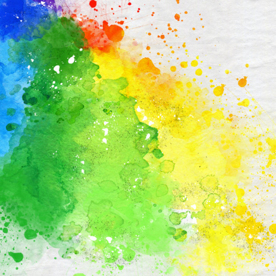
The colors in the LTS logo are red and green, in the LTS corporate design they are red, green and grey.
Or to put it another way:
WE Care. WE Create. WE Deliver.
Picture: LTS Lohmann Therapie-Systeme AG